Working inside brands—and building them from scratch.
Brand Design
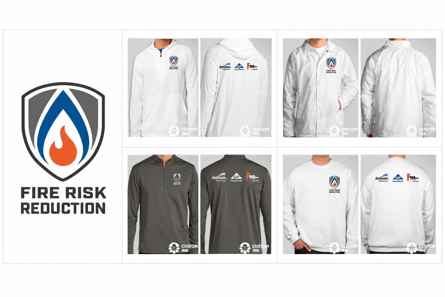
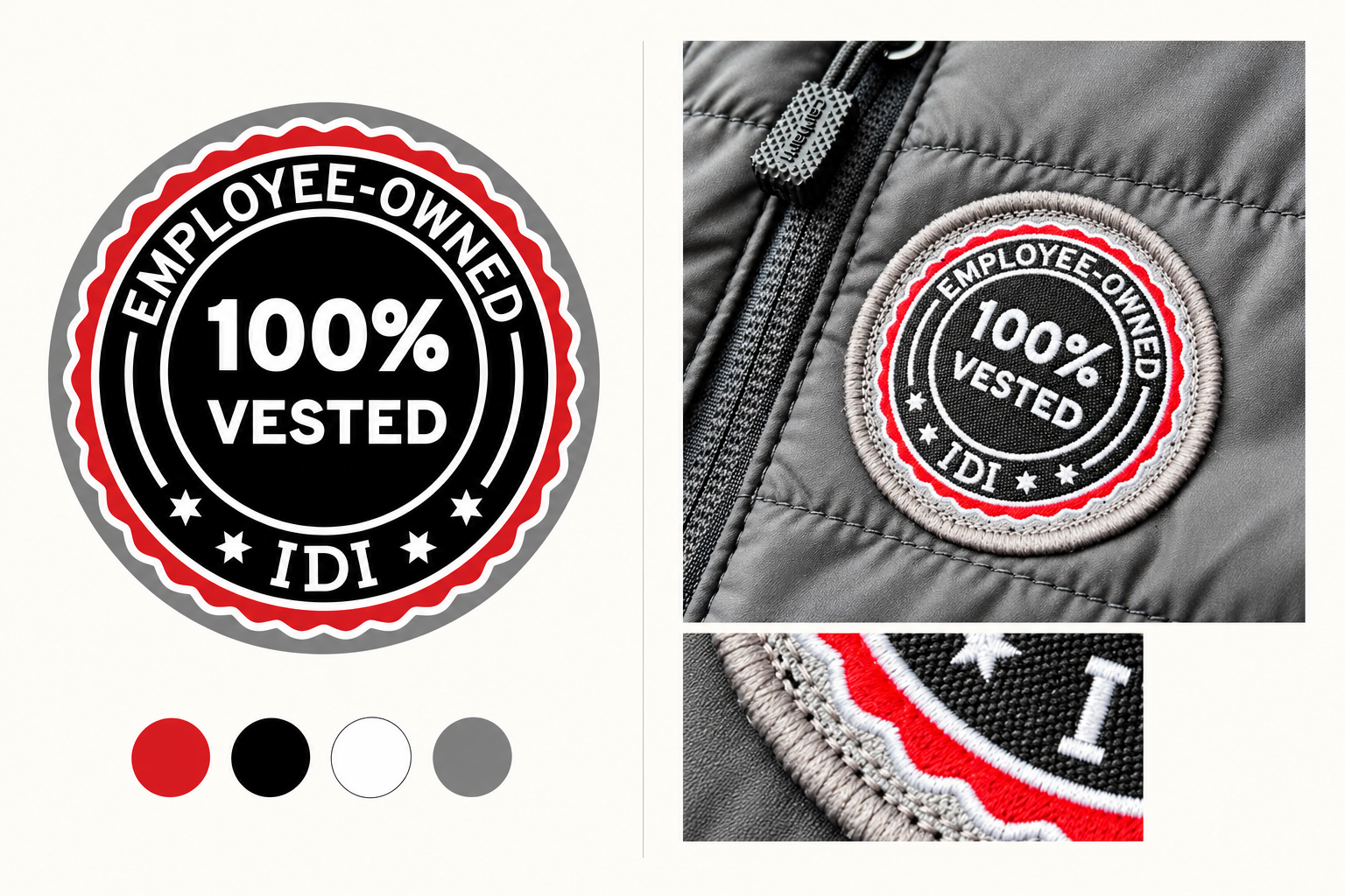
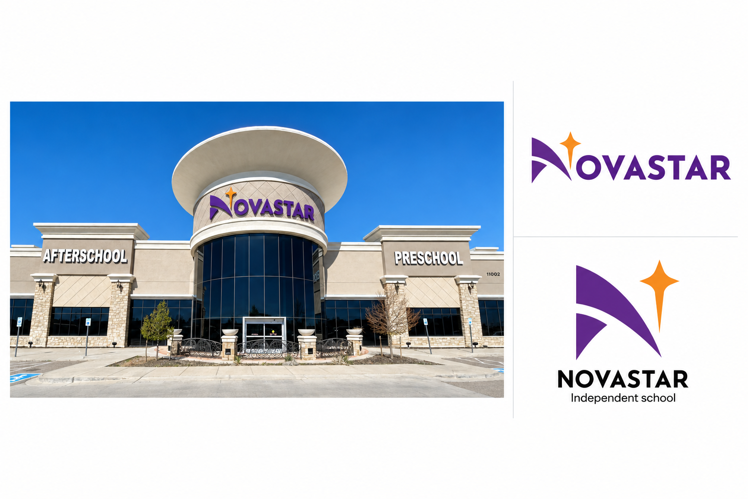
Identity work is as much about understanding constraints as it is about introducing a new idea. I have created original marks, updated existing logos and designed additions that needed to sit naturally beside work I did not create.
That distinction mattered with Jedson, where I designed the Heavy Industrial icon within an established family of market graphics. It also shaped the work for IDI, where an updated primary mark, supporting company graphic and employee-ownership badge created a more useful visual system. Across each project, I focused on making the identity practical enough to move beyond the initial presentation and into everyday use.

Social Design
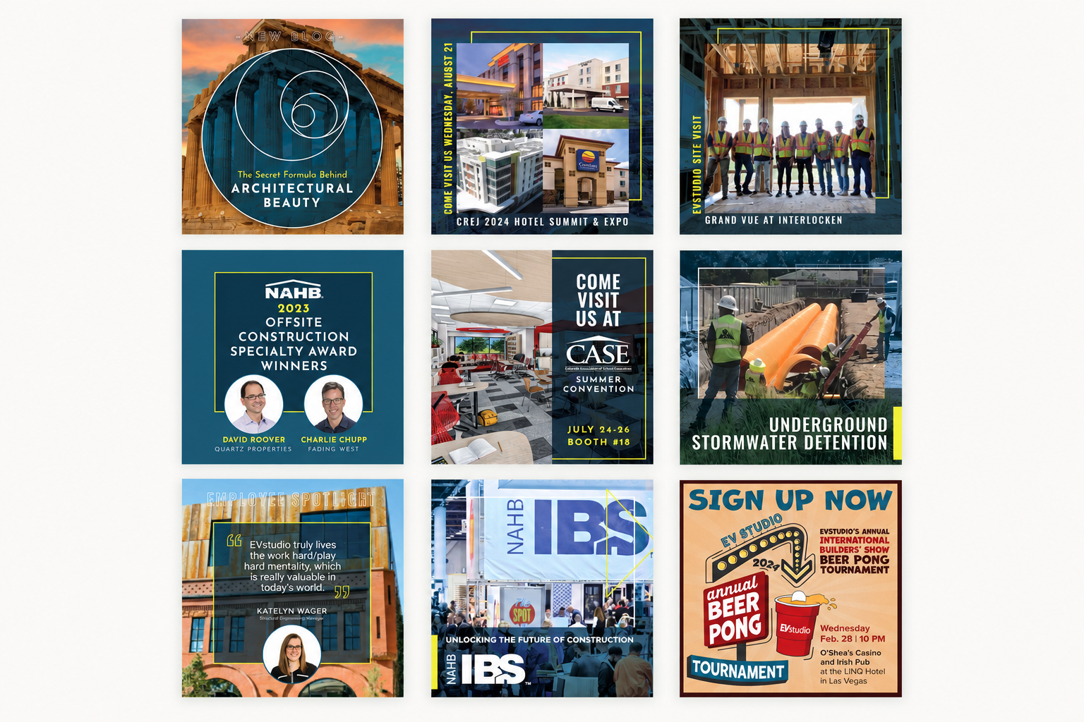
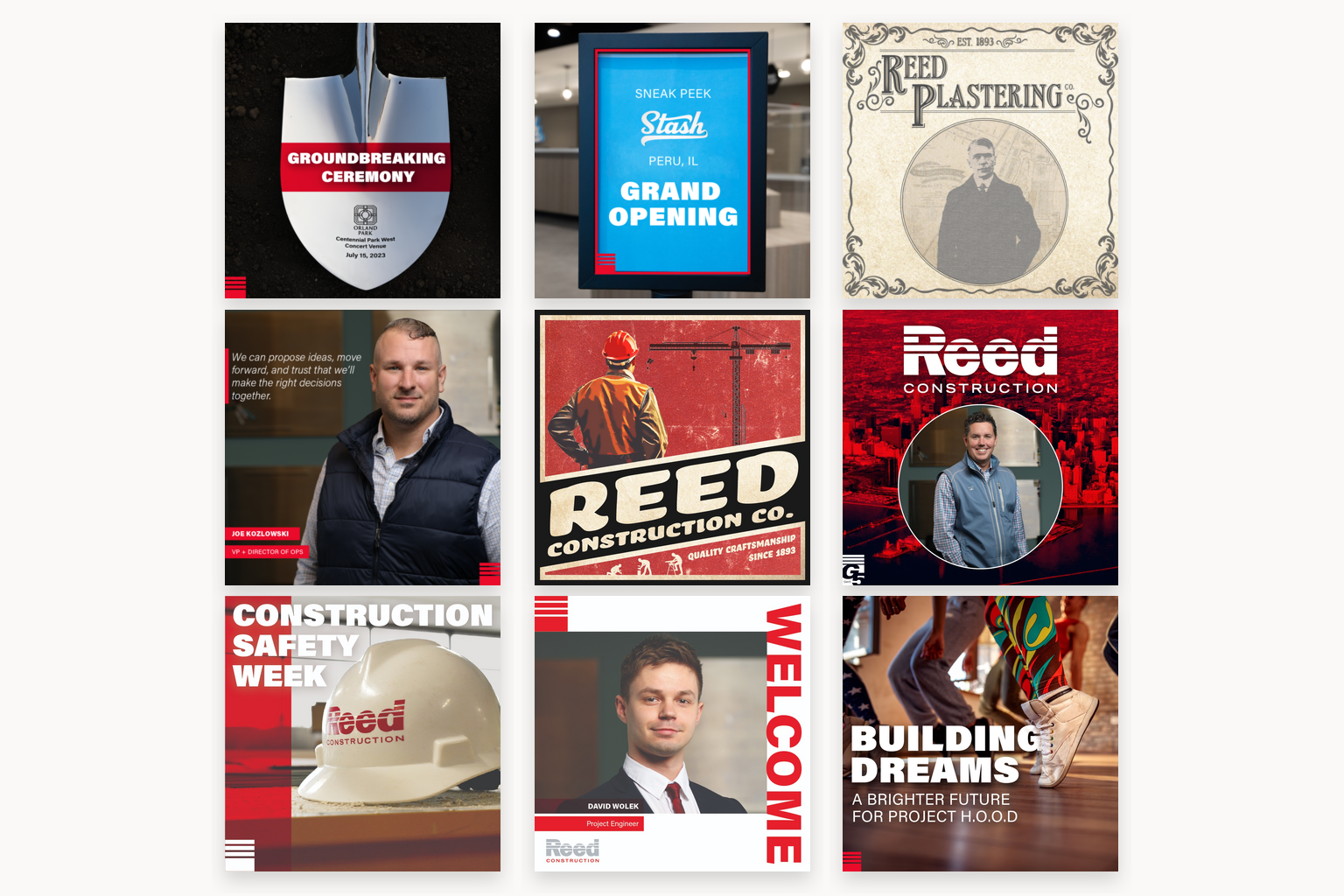
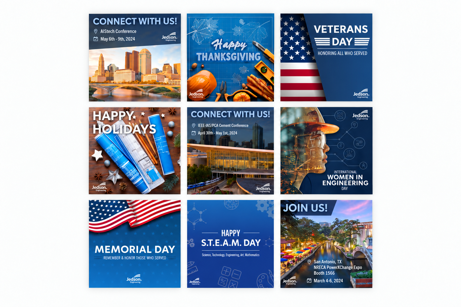
Social content changes quickly, but the brand should not disappear with each new post. For Reed Construction, Jedson Engineering and EVstudio, I developed adaptable layouts that could support the ongoing needs of each company.
Repeated decisions around typography, image treatment and color created continuity across the work. The structure remained recognizable while giving each announcement enough room to feel specific to its subject. These grids present the graphics as connected systems rather than a collection of isolated posts.
Large-Format & Environmental Graphics
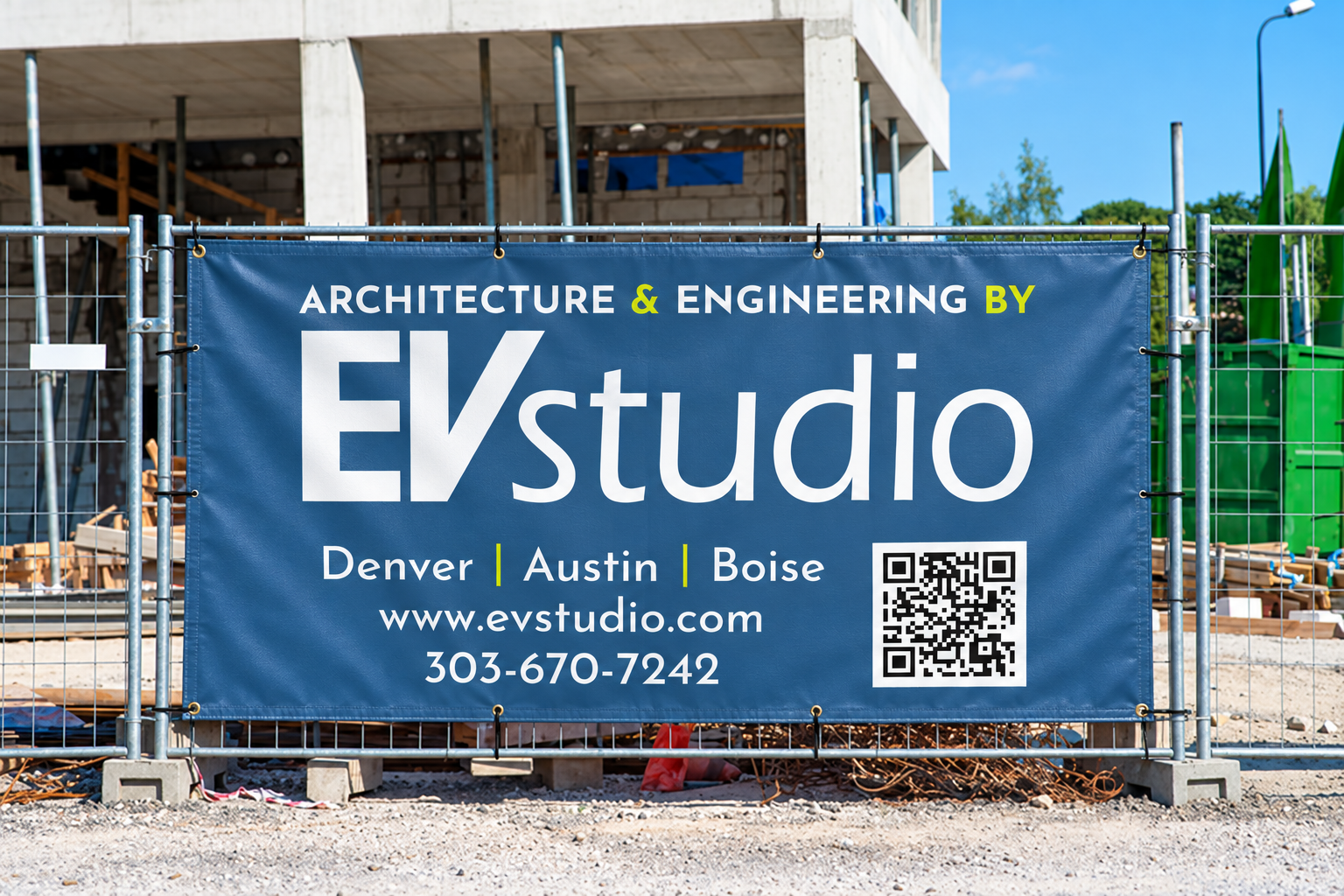
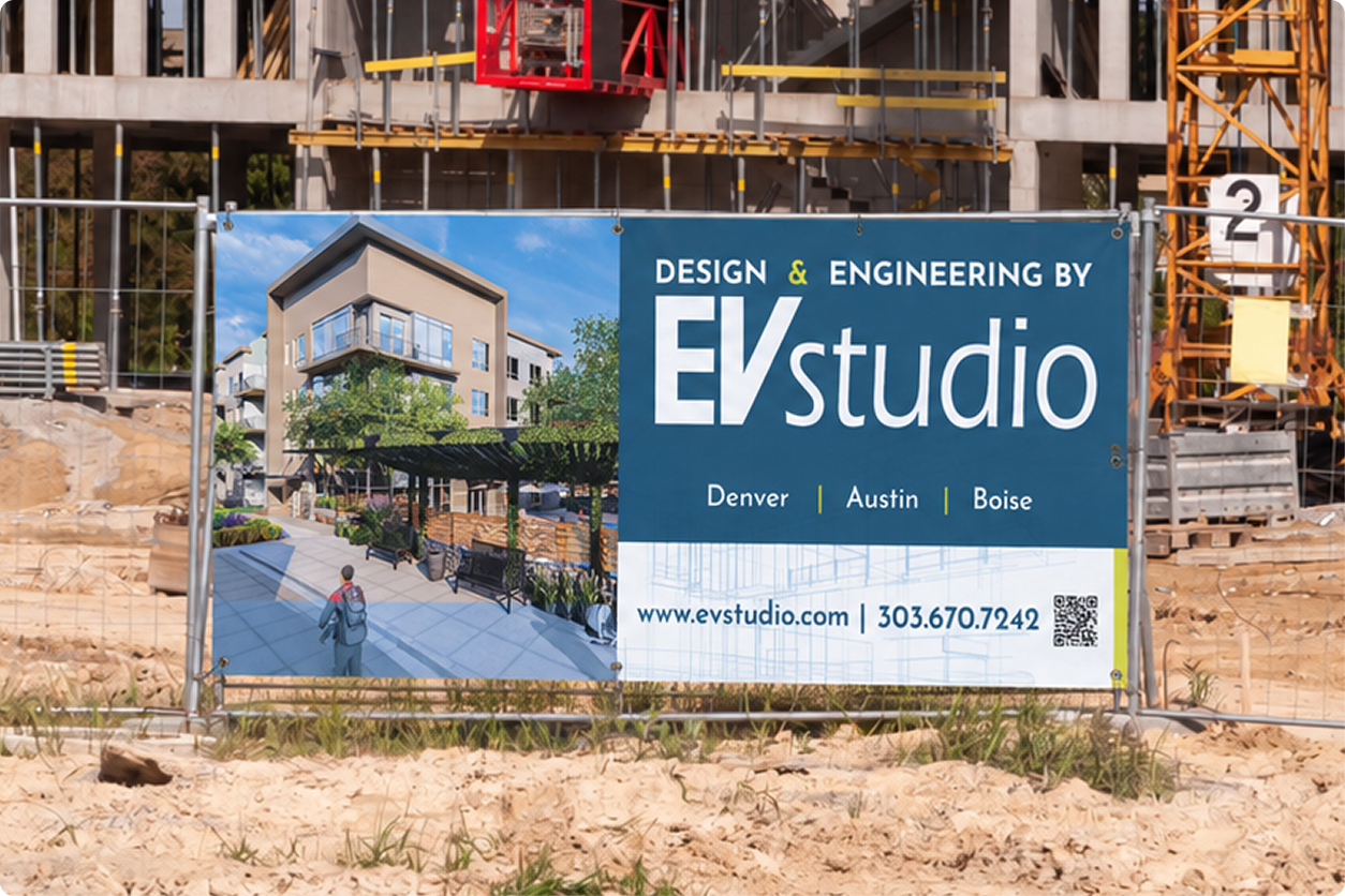
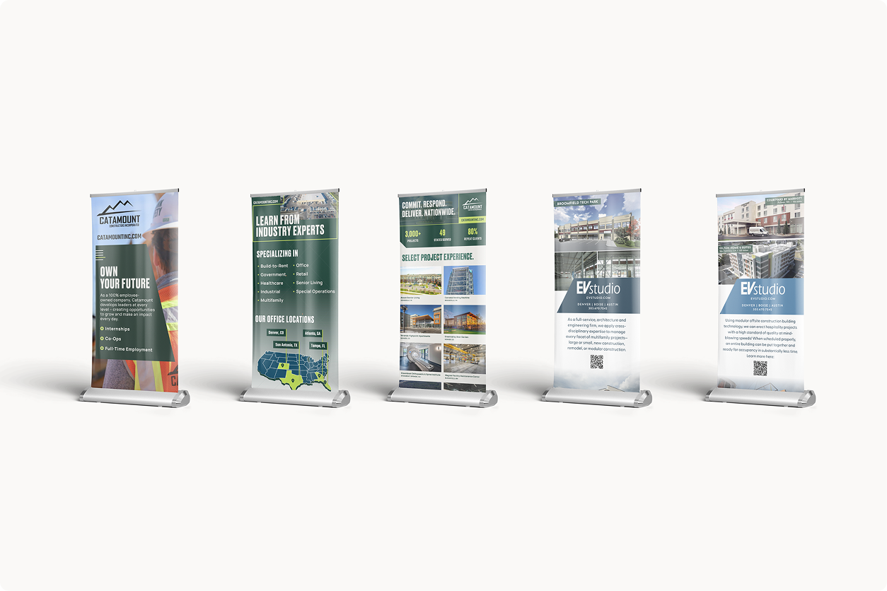
Designing for physical space changes how information needs to work. Retractable banners have to communicate quickly from a distance, while jobsite signage brings the brand into an active public environment. These projects show how I adapted existing visual systems for larger formats without losing clarity or recognition.
Print & Editorial Design
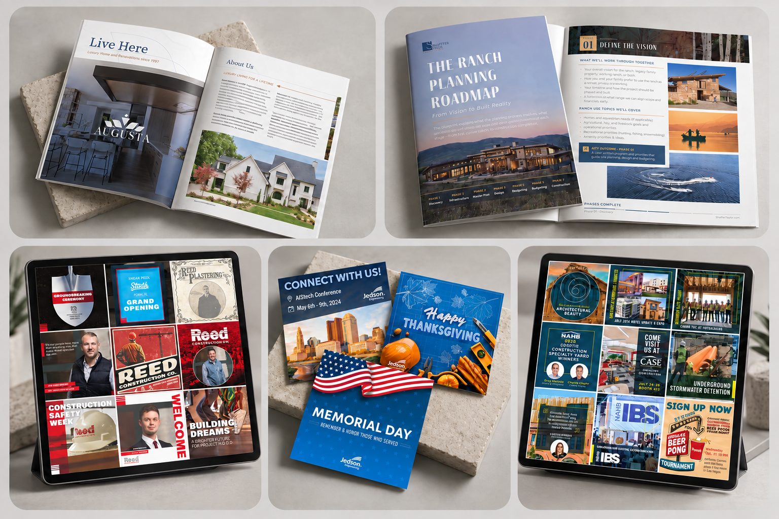
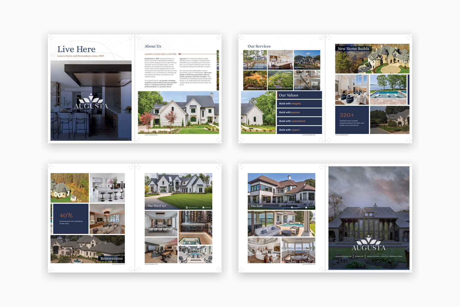
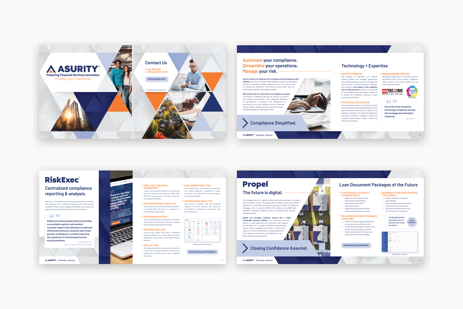
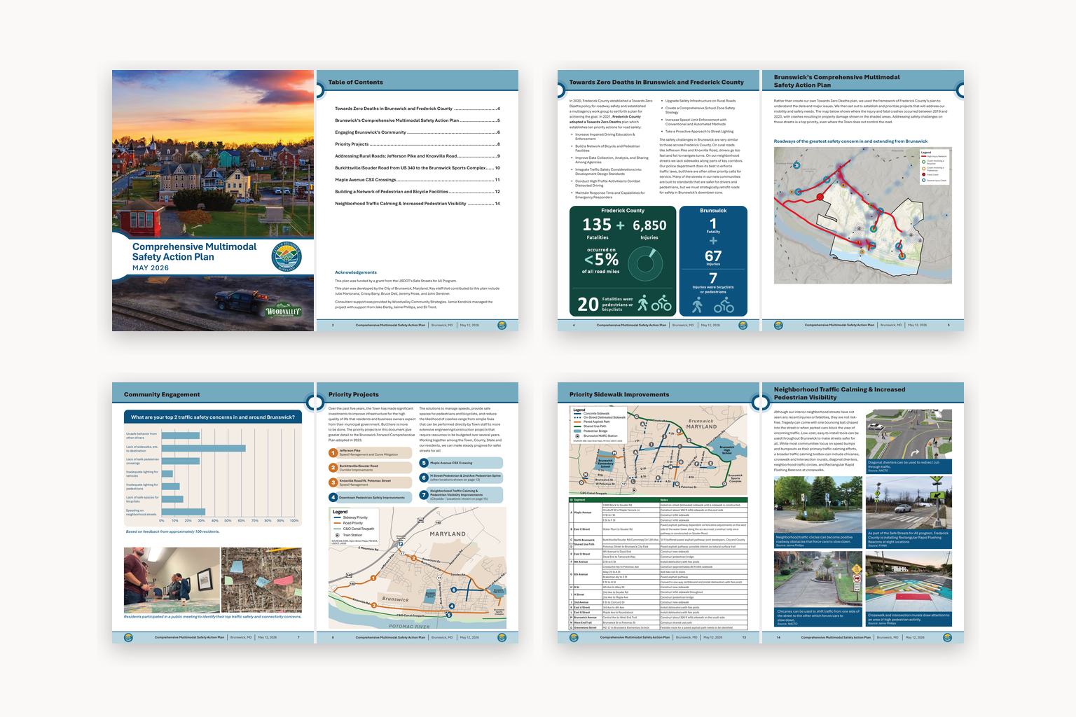
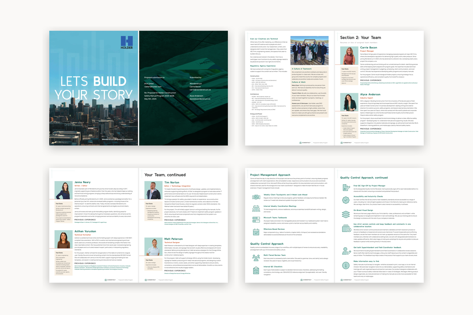
Print and long-form documents require a quieter kind of design. The work needs to carry the identity without getting in the way of the information. I focused on hierarchy and repeatable page structures that helped readers understand where they were and what mattered next.
The selected pieces range from outward-facing marketing materials to documents built for internal or technical use. Each required a different visual tone, but all needed enough structure to remain clear across multiple pages. General spreads are shown where necessary to protect private client information while keeping the design visible.


Presentation Design
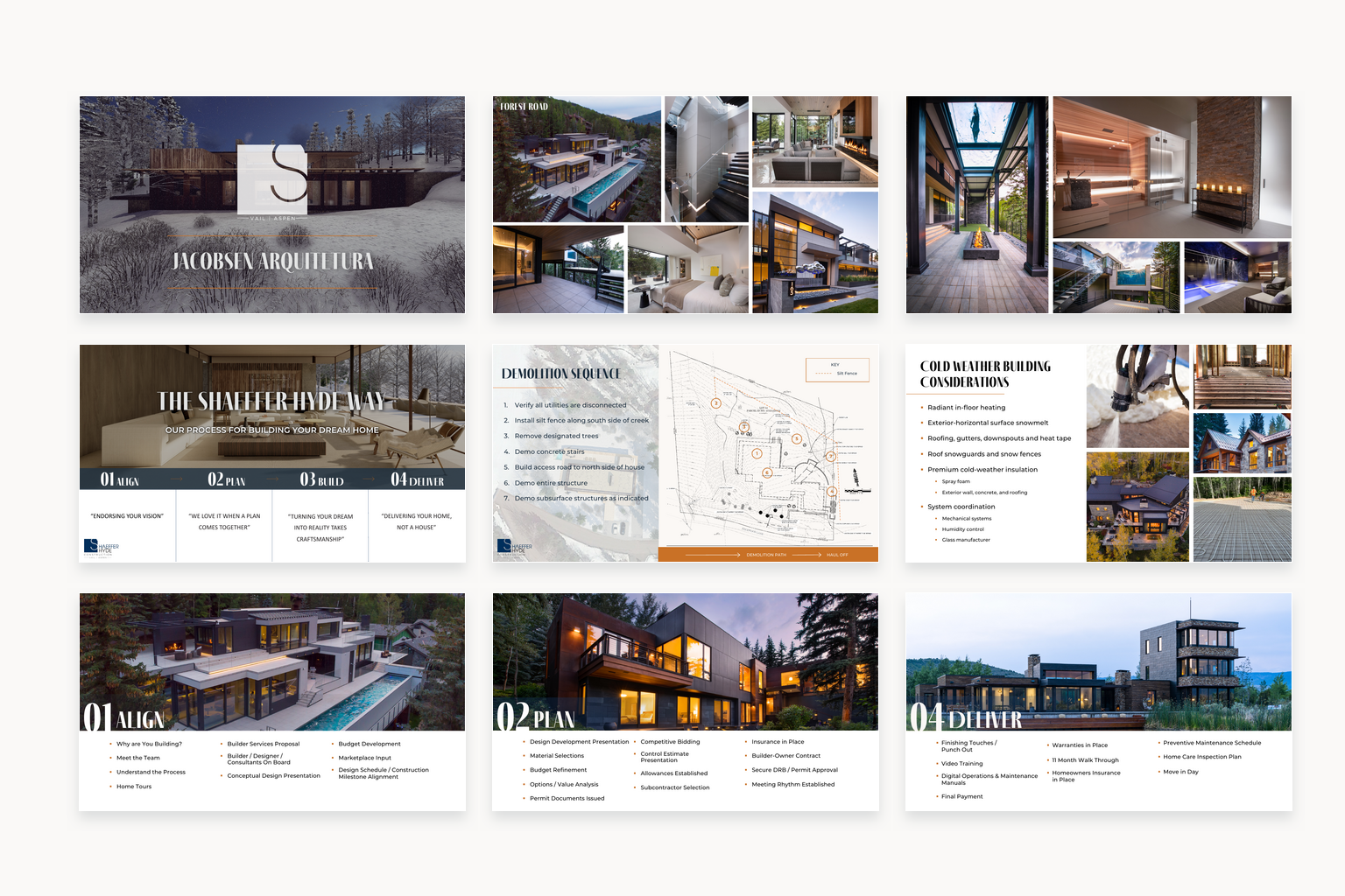
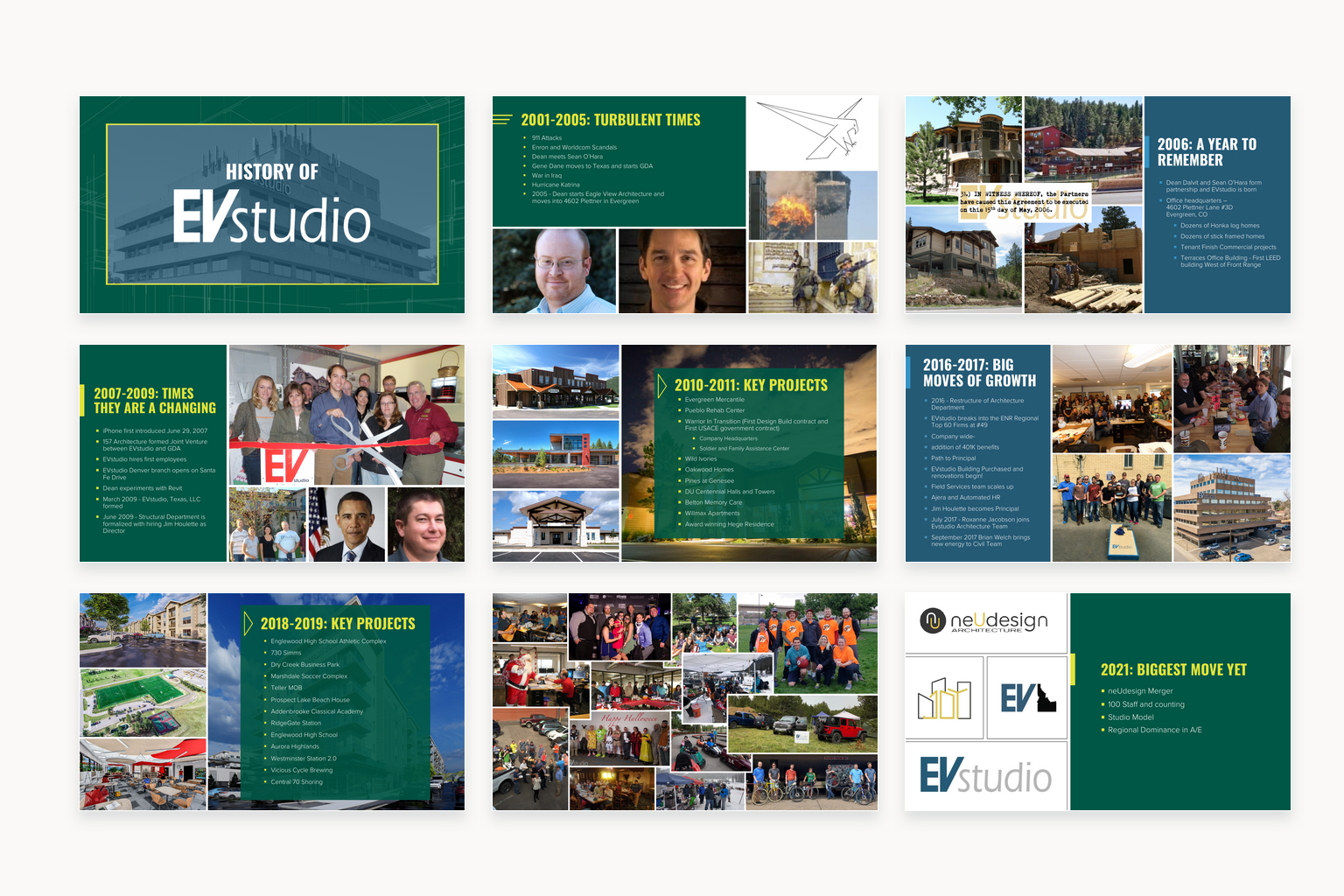
Presentation design has to work both slide by slide and as a complete sequence. A deck needs enough consistency to feel connected while still accommodating changes in subject, image density and the amount of information being presented.
The Shaeffer Hyde presentation uses architectural photography and restrained typography to support a high-end residential story. EVstudio’s company history deck is denser, bringing archival material and years of project history into a shared structure. Together, the decks show how the same approach to hierarchy can adapt to two very different brands.